Redesign of CTV/Crave/Noovo Showpage
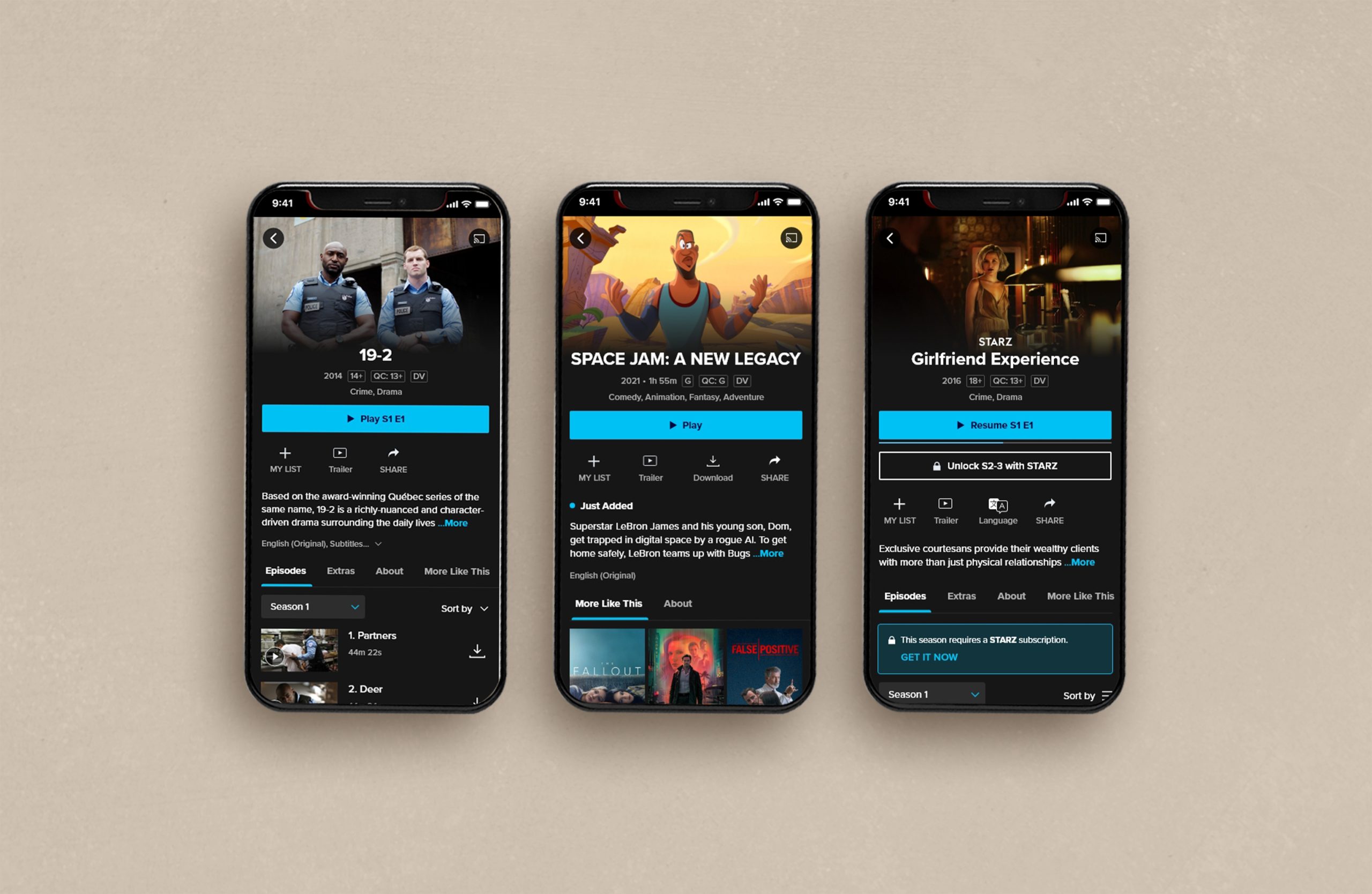
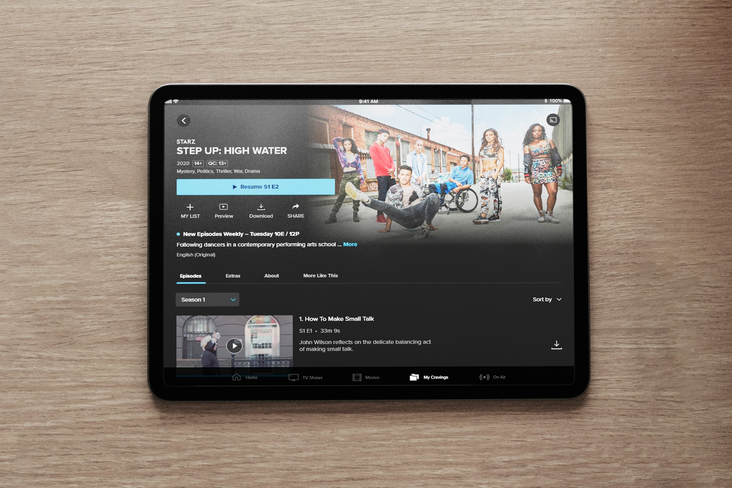
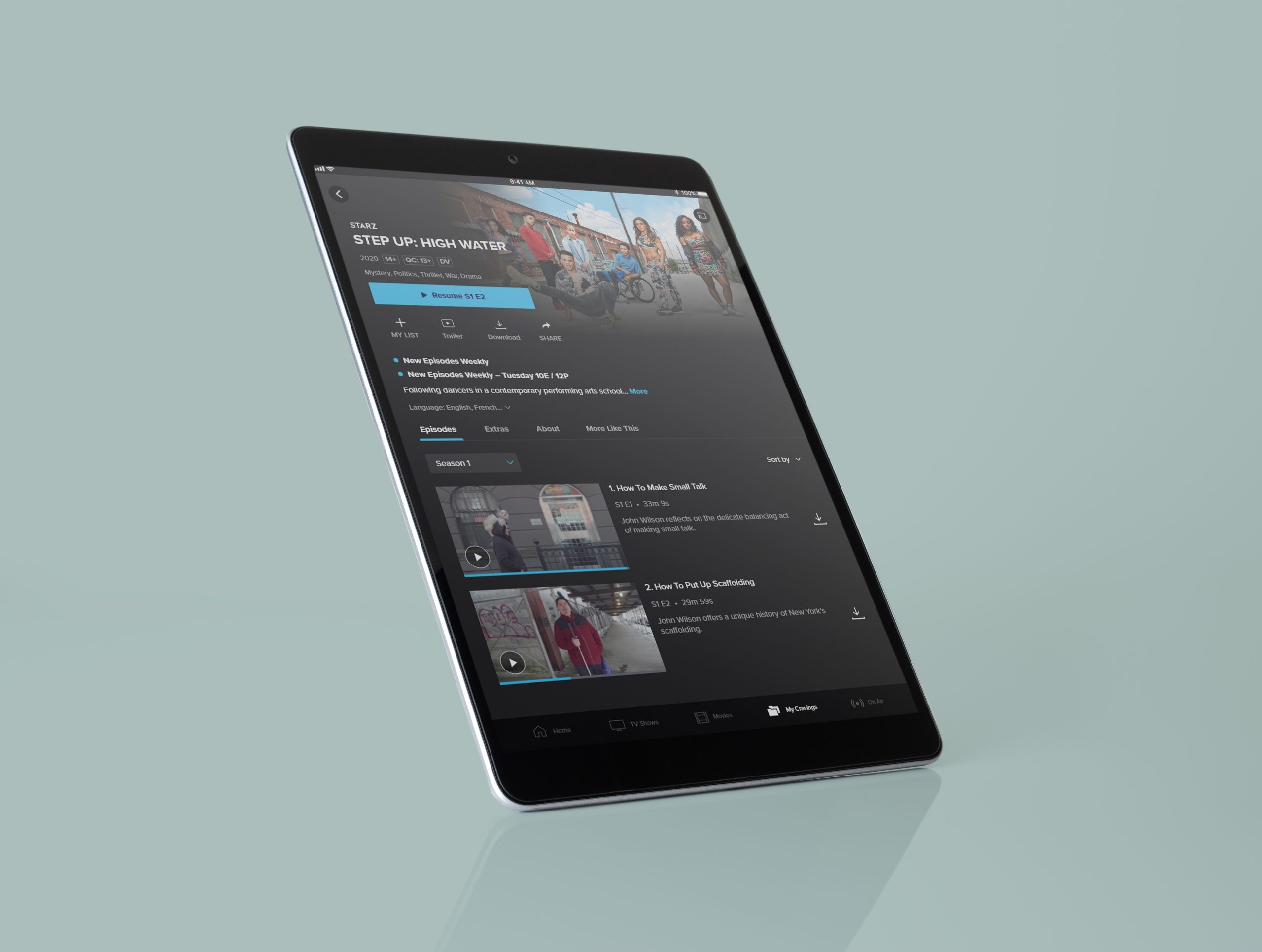
The original show page was designed and built with only 1 brand to consider (Crave). There had not been a significant change to layout or refresh since it’s launch in 2018. With CTV and Noovo now on the ACE platform and with very different business needs, it was time to design a new experience holistically.
Project Summary
The original show page was created with a singular brand in mind, Crave, and had remained unchanged since its launch in 2018. However, with the integration of CTV and Noovo onto the ACE platform, it was necessary to design a new experience that took into account the differing business needs of these brands. This required a comprehensive overhaul of the layout and a fresh approach to the overall design. The original page had not undergone any significant updates or improvements since its inception, making this change imperative to ensure a seamless and effective user experience.


Discovery
During the discovery phase, it was determined that the original website design was not sufficient for the evolving needs of the platform. User research was conducted to understand the pain points and frustrations of the current user experience. Through this research, it was determined that the site was not user-friendly, lacked visual appeal, and was not optimized for mobile devices.
The Problem
The following problems were identified during the discovery phase:
- Unattractive and outdated design
- Improve accessibility and readability.
- Inadequate mobile optimization
- Difficult navigation
- Limited brand differentiation
- Highlight further engagement points to keep customers within the
experience longer.


Business Problem
The current design of the website is negatively impacting the user experience and making it difficult for customers to access important information and understand what they have access to.
- Long pages hide extra content, and poor hierarchy of elements
- Unclear content access with poor plans to include more CTAs
- Accessibility and legibility issues
Goals
The business goals for this project:
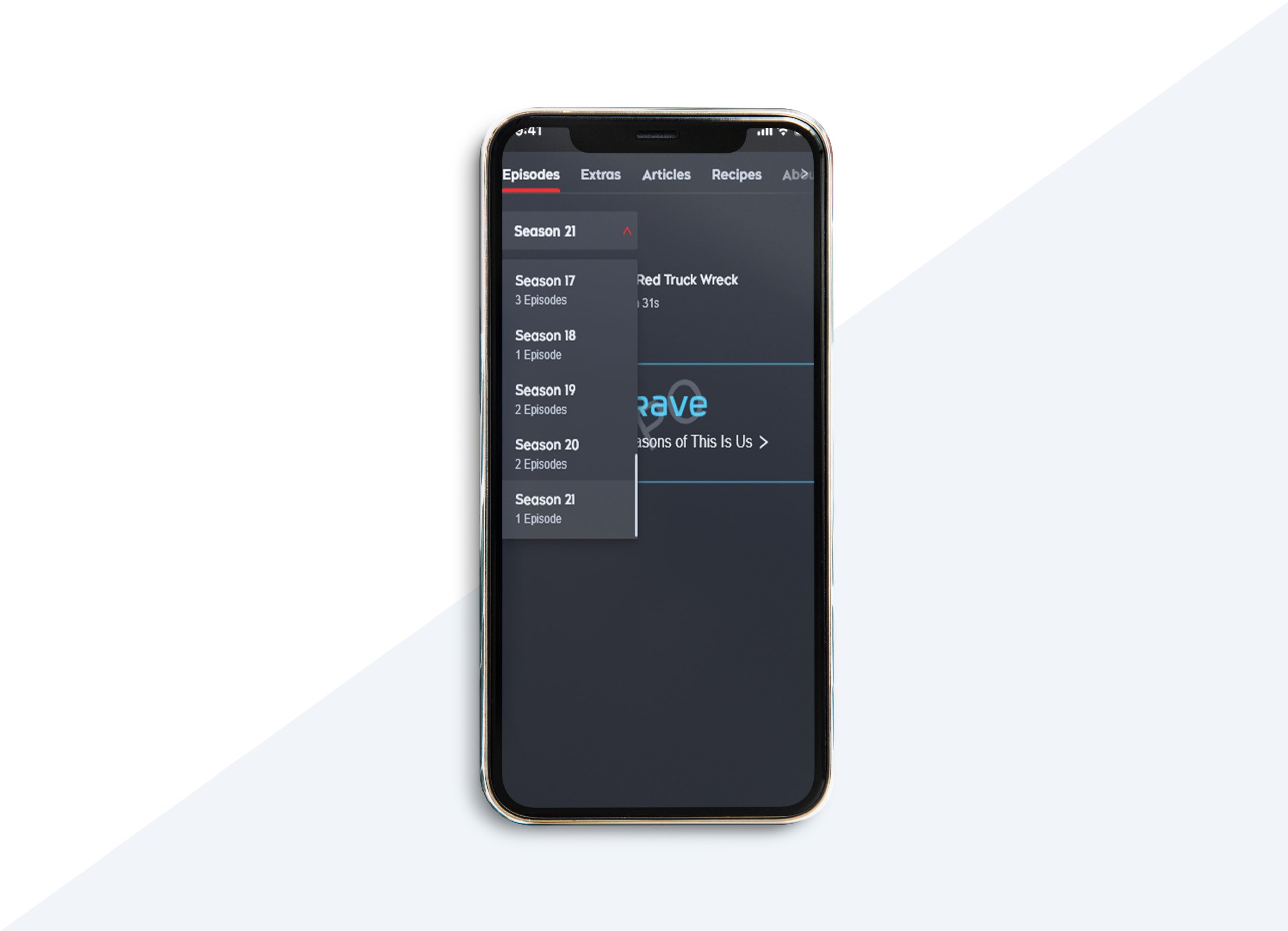
- Improve the visibility of extra content by reducing the length of scrolling pages
- Create a clear hierarchy of elements to highlight the most important information
- Enhance the clarity of content access to make it easier for customers to understand
- Address accessibility and legibility issues to improve readability and usability for a diverse customer base.
Design Process
The design team followed the following steps in the design process:
- Conducted user research to identify user pain points and frustrations with the current design
- Defined the business goals for the redesign
- Created wireframes and prototypes for testing
- Conducted user testing to refine and validate design choices
- Developed the final design, incorporating feedback from user testing
- Implemented the design on the website
Results
The redesigned website resulted in numerous improvements and positive outcomes, which were quantified through various metrics. The following are some of the key results and metrics:
- Improved User Engagement: User engagement was measured by tracking the amount of time users spent on the site. Following the redesign, the average time spent on the site increased by 20%, indicating that users were more engaged and interested in the content.
- Increased User Retention: User retention was measured by tracking bounce rates, which indicate the number of users who leave the site after viewing only one page. The redesign resulted in a significant decrease in bounce rates, with a decrease of 12% being observed. This suggests that users were finding the site more useful and were more likely to remain on the site for longer periods of time.
- Higher Conversion Rates: Conversion rates were measured by tracking the number of sales made through the site. The redesign resulted in a substantial increase in sales, with a 13% increase being observed. This indicates that users were finding the site easier to use and were more likely to complete purchases.
- Better User Experience: The user experience was measured by tracking user feedback and conducting surveys. The redesign received overwhelmingly positive feedback from users, with 66% of users reporting that they found the site easier to use and more visually appealing. Additionally, surveys revealed that users found the site more intuitive and better suited to their needs.
These results demonstrate the effectiveness of the redesign and the impact it had on the user experience. The improvements in engagement, retention, and conversion rates are particularly significant, as they directly translate into tangible benefits for the business.
Bounce rate decrease of 12%
Conversion rate increase of 13%
Positive feedback increase by 66%
Conclusion
The redesign of website and app platform was a critical success, achieving all of the established business goals. The new design not only provided a better user experience but also effectively showcased the unique offerings of multiple brands. By conducting thorough user research, testing multiple design concepts, and incorporating user feedback, the design team was able to create a site that met the needs of users and the business
