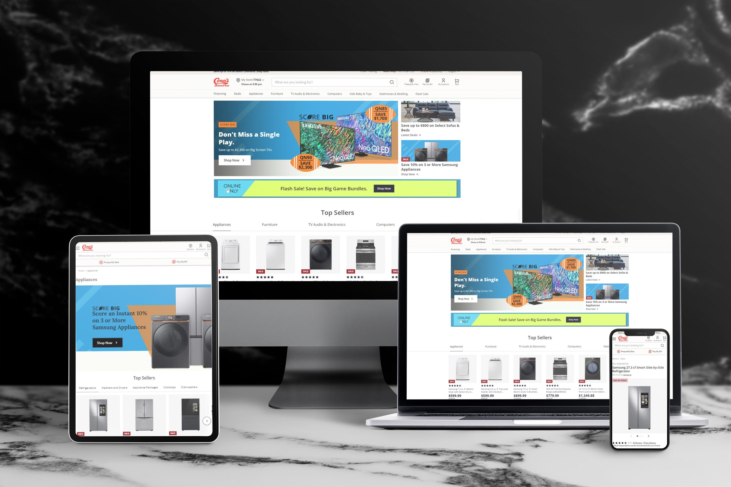
E-commerce • 2021
E-commerce Website Redesign
Complete UX/UI redesign of an e-commerce platform that was under performing
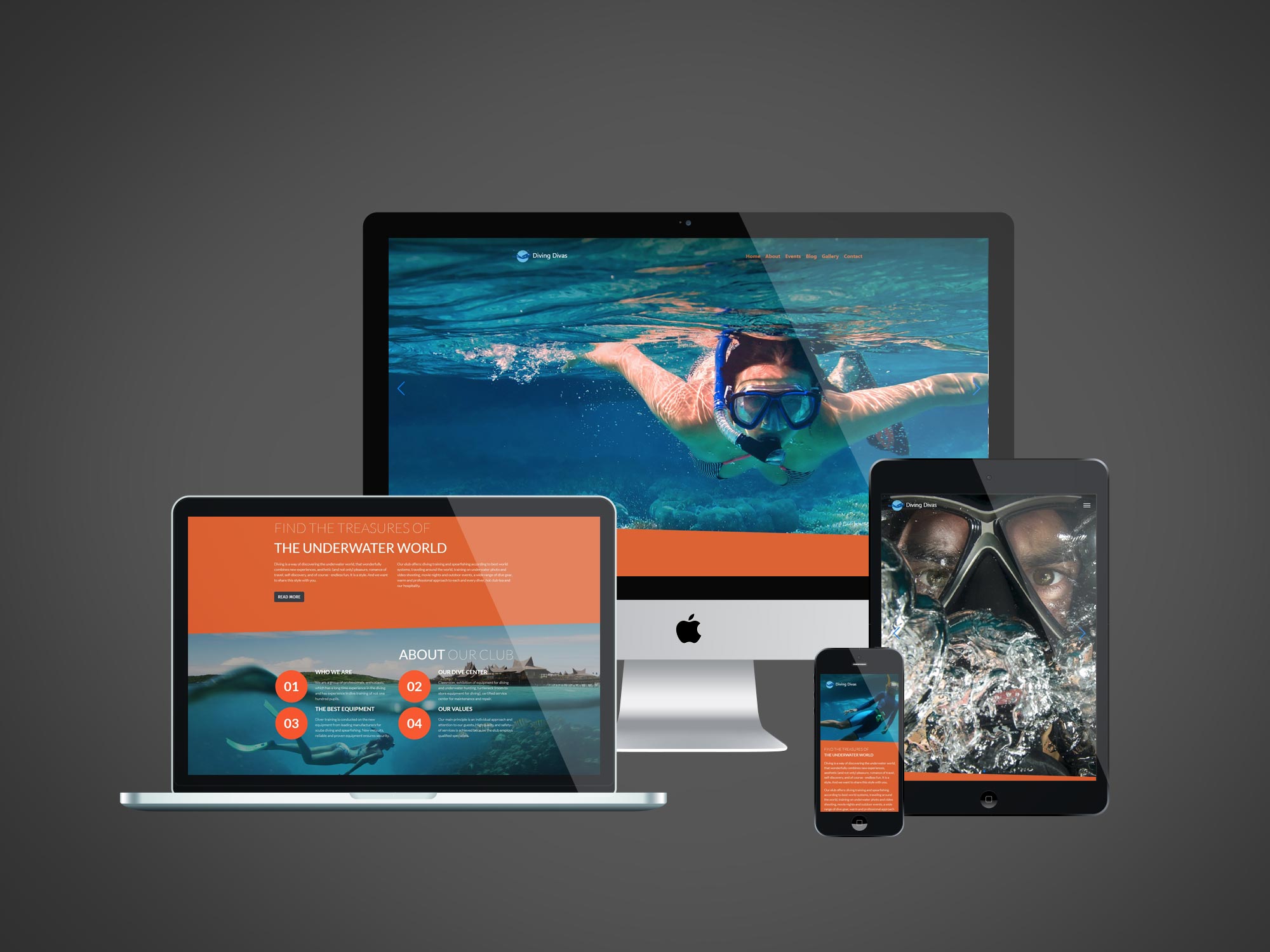
Travel & Recreation
Scuba Diving Website Redesign
Transforming an outdated diving website into a modern, user-friendly platform that connects divers with their passion
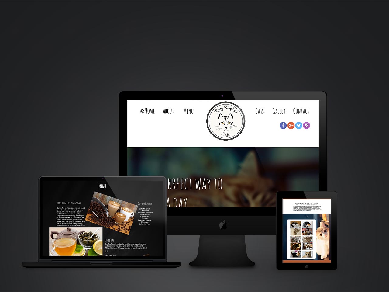
Hospitality & Pet Care • 2019
Cat Cafe Design
A cat cafe is a type of cafe where customers can interact with cats while they enjoy their food and drinks