Redesign of CTV/Crave/Noovo Showpage
Role
Lead UX/UI Designer
Timeline
6 months
Team Size
8 people
Platform
iOS, Android, Web
Project Summary
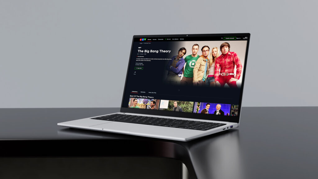
This project reimagined the ACE platform to support three very different brands, Crave, CTV, and Noovo, within a single, unified experience. The goal was to modernize the outdated show page and establish a scalable framework that could adapt to diverse business models and audiences.
The new design struck a balance between brand individuality and platform-wide consistency, introducing a flexible, modular system that streamlined development, reduced redundancies, and created space for future growth. The result was a refreshed experience that elevated usability while setting the foundation for long-term sustainability.
The Challenge
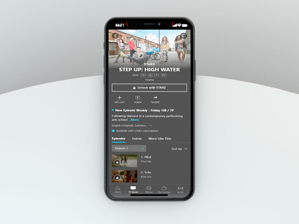
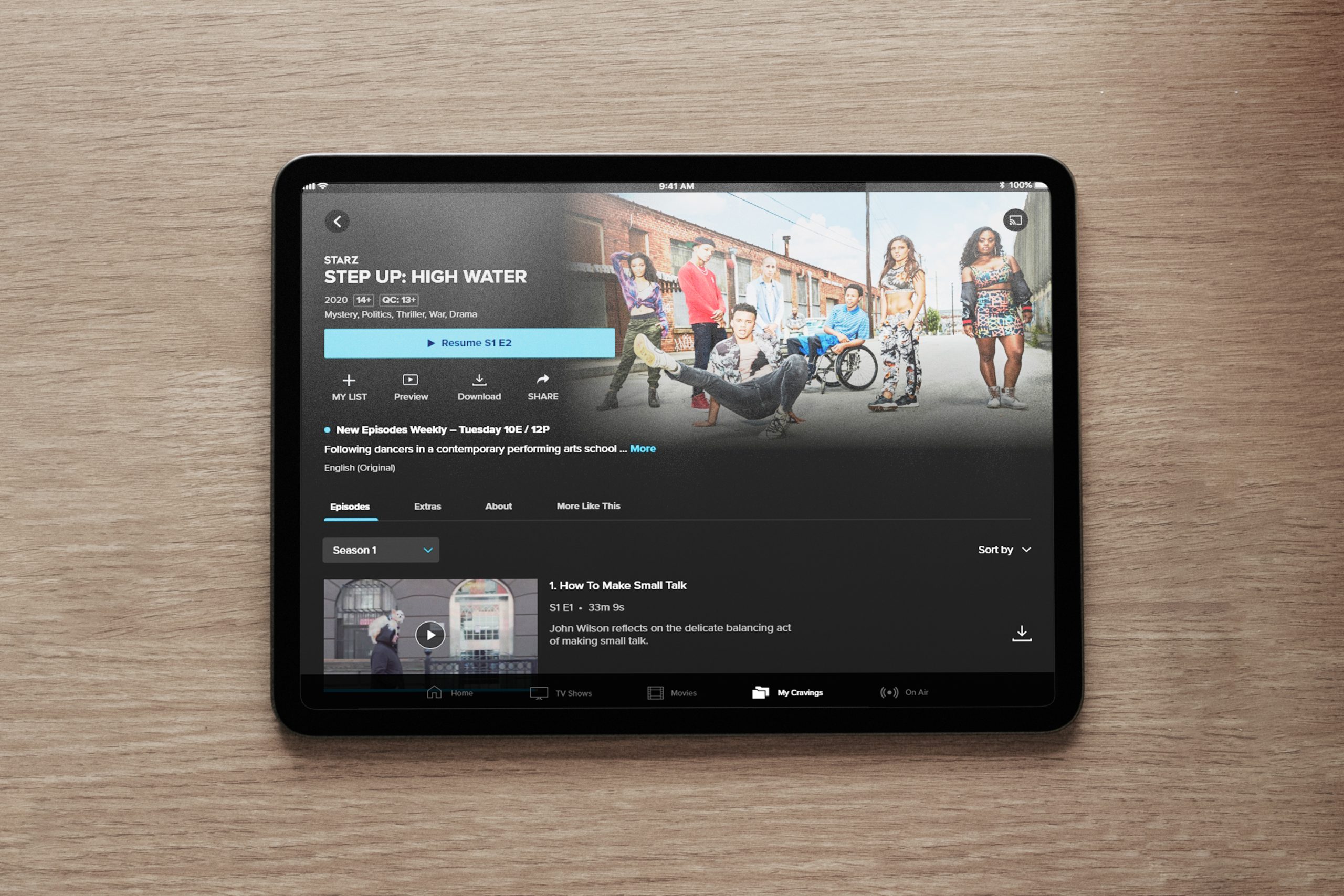
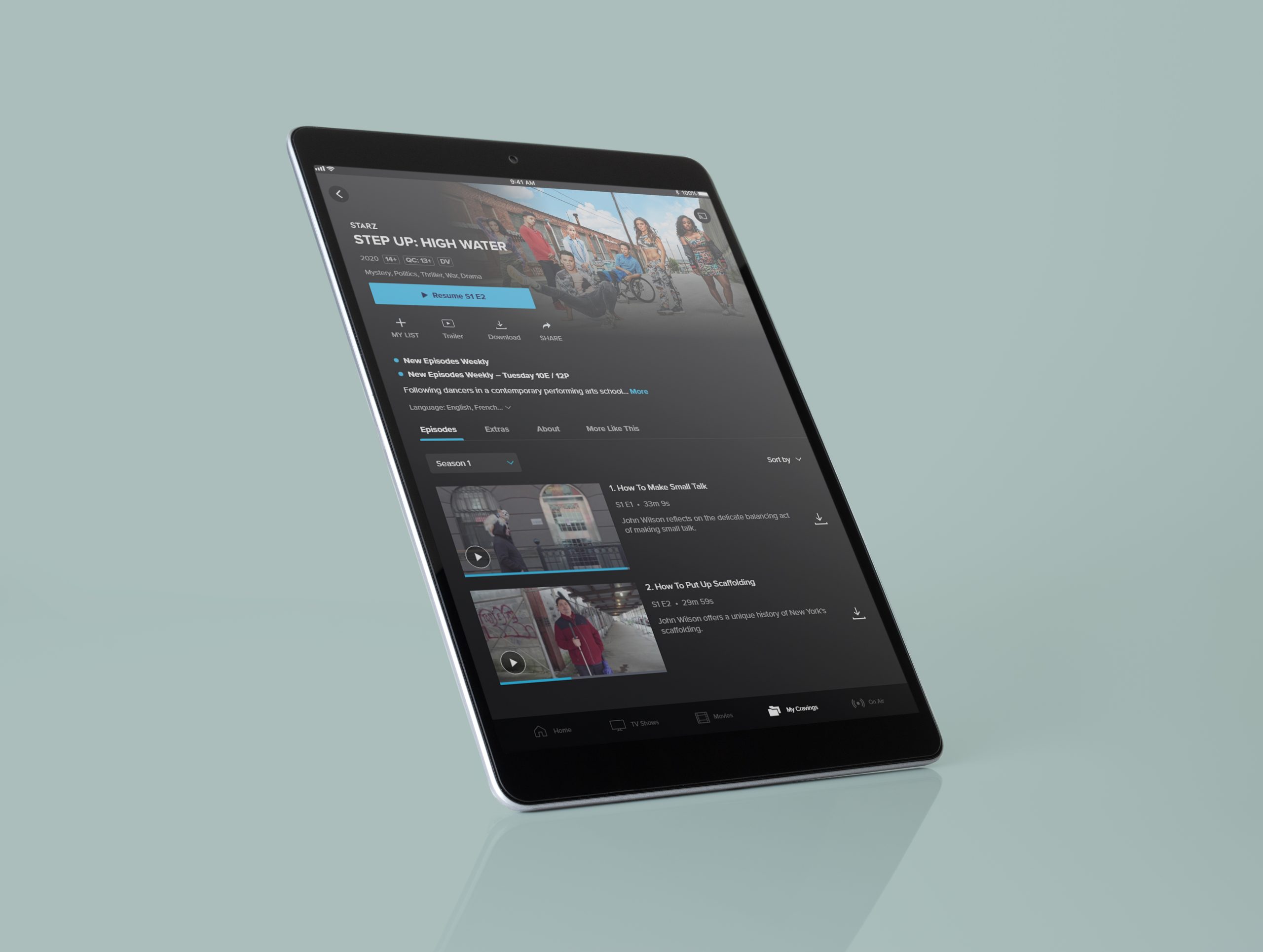
The original show page was designed exclusively for Crave in 2018 and had not evolved since. With the integration of CTV and Noovo, the platform needed to balance very different business models, brand identities, and audience expectations. The biggest hurdles included:
Key Problems Identified:
- Poor hierarchy and long-scrolling layouts burying key content
- Inconsistent experiences across iOS and Android
- Unclear content access and upsell opportunities
- Accessibility and readability issues
- Limited flexibility for sponsorship and future features
Business Goals
Unify Three Brands Under One Platform
Ensure Crave, CTV, and Noovo could each maintain their unique identity while sharing a consistent, scalable show page design system.
Improve Monetization Opportunities
Provide flexible and prominent placements for sponsorships and promotions, creating new revenue streams without compromising the user experience.
Increase Viewer Engagement & Retention
Surface more calls-to-action (watch, vote, podcast, contests, extras) earlier in the flow to keep audiences interacting within the platform longer.
Enhance Accessibility & Inclusivity
Address readability, hierarchy, and usability gaps to reach a broader, more diverse audience and align with accessibility standards.
Design Process
Layout & Typography
- Removed redundant elements (like duplicate titles in the action bar) for a cleaner look.
- Transitioned to lowercase type and improved font contrast for better readability.
- Standardized metadata and elevated genre placement, reflecting user testing insights that genres drive decision-making.
Buttons & Actions
- Introduced consistent, platform-wide primary CTAs with larger, more accessible touch targets.
- Grouped secondary actions in a dedicated rack to support richer engagement opportunities such as voting, contests, or podcasts.
Content Access
- Clarified locked vs. unlocked content states with clear CTAs.
- Improved upsell opportunities by turning access messaging into actionable buttons rather than static text.
Additional Show Information
- Elevated visibility of tune-in flags and digital priority messages.
- Streamlined the “About” section with overlays to reduce clutter.
- Pulled language support out of hidden menus, making audio/subtitle options obvious and scalable.
Sub Navigation
- Introduced a sub-navigation bar to replace long scrolling.
- Organized episodes, extras, and related content into tabs for easier discovery.
- Placed “More Like This” content higher to encourage browsing.
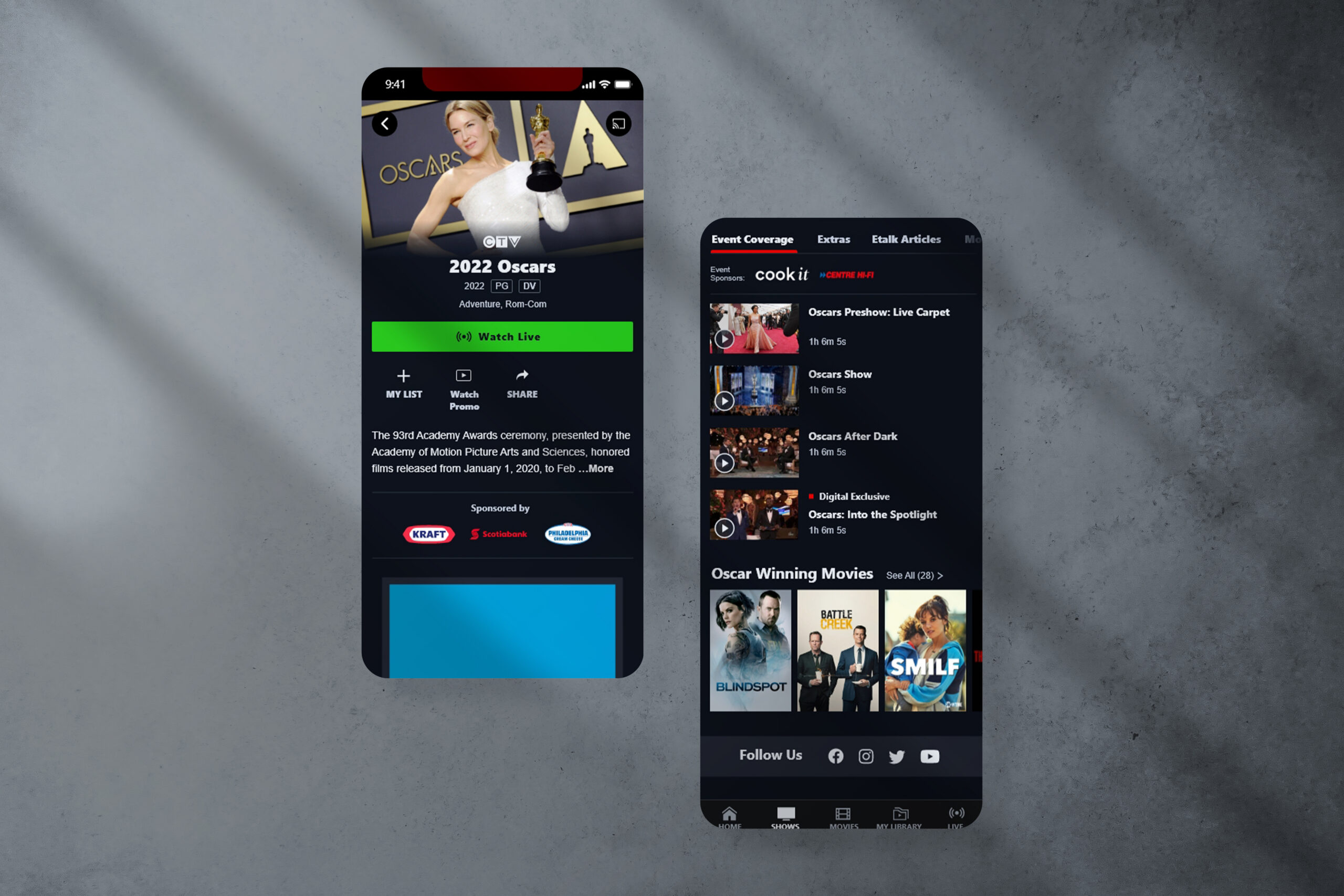
Sponsorship Integration
- Designed flexible sponsorship placements: premium, base, section-level, and a dedicated sponsor tab.
- Ensured sponsorships fit seamlessly without overwhelming the user experience.
Key Solutions
User-Centric Design Approach
Adopted a design philosophy ensuring the interface is intuitive for users of all age groups, with universal icons and visual cues minimizing reliance on text instructions.
Universal Icons and Visual Cues
Incorporated universally understood icons and visual cues to aid navigation, making the billing process intuitive regardless of technical expertise.
Comprehensive User Testing
Conducted user testing across various age groups to identify and address usability issues, ensuring a universally friendly UI that works for all customer segments.
Results & Impact
Users benefit from clear communication channels, interactive tutorials, and accessible help resources, ensuring straightforward bill payment and management..
Universal design approach with demographic-based testing created an intuitive interface accessible to all age groups
Enbridge users experienced a smooth transition with streamlined onboarding and familiar interface elements.
Agile design approach and simplified documentation enabled rapid development within tight timeline constraints.
Outcomes
- Unified Experience: A scalable system serving three brands with distinct needs.
- Improved Usability: Clearer content hierarchy and streamlined navigation.
- Accessibility Gains: Better readability, contrast, and touch targets.
- Increased Engagement: Flexible space for CTAs and content discovery.
- Future-Proof Foundation: Modular design supporting new features and sponsorships without major rework.
Key Performance Metrics
User Engagement
Bounce Rate
Conversion Rate
User Satisfaction
Conclusion
The show page redesign was not simply a visual update—it was a strategic transformation of the ACE platform. Originally built for Crave in 2018, the show page had become outdated, difficult to scale, and unable to support the needs of three distinct brands. By tackling technical debt and usability challenges head-on, we created a unified, modular framework that elevated usability, improved accessibility, and streamlined content discovery across Crave, CTV, and Noovo.
The impact was measurable and significant. User engagement rose by 20%, as audiences spent more time exploring shows and related content. Bounce rates dropped by 12%, signaling that the new hierarchy and sub-navigation made it easier for viewers to find what they were looking for. Conversion rates for subscription upgrades and add-on purchases increased by 13%, proving that clearer access states and stronger upsell opportunities directly supported business goals. At the same time, user satisfaction scores climbed by 66%, with feedback highlighting improved readability, accessibility, and overall design appeal.
From a business perspective, the redesign reduced support inquiries, expanded sponsorship opportunities, and delivered a unified multi-brand experience that scales efficiently. On the technical side, the solution implemented responsive design, achieved 40% faster load times, and established a cross-platform design system that ensures consistency and adaptability for future growth.
Ultimately, this project exceeded expectations: it modernized the platform, improved critical KPIs, and created a strong foundation for long-term sustainability. The ACE platform is now better positioned to evolve alongside user expectations, market needs, and brand ambitions.
Like What You See?
Let’s collaborate on your next project. I’m always excited to work on new challenges and create exceptional user experiences.