Shopper's Drug Mart Platform Redesign

Target Users
Distribution teams, pricing managers, store operations, and regional coordinators
Timeline
8 months from discovery to launch
My Role
Lead UX/UI Designer, User Research, Prototyping
Project Summary
Shoppers Drug Mart, one of Canada’s largest and most trusted pharmacy chains, was struggling with a distribution and pricing platform that hadn’t evolved in over two decades. Originally built 20 years ago, the system had become slow, outdated, and inaccessible through modern web browsers. These limitations created inefficiencies for the teams who relied on it daily, impacting both productivity and scalability.
To address these challenges, Shoppers Drug Mart initiated a complete UX/UI redesign of the platform. The goal was to modernize the experience without losing the core functionality that teams depended on. By rethinking the interface and streamlining workflows, the redesign aimed to deliver a faster, more intuitive, and efficient solution—ultimately transforming a legacy system into a tool aligned with today’s business needs.
The Challenge
Shopper’s Drug Mart’s core distribution and pricing platform was built 20 years ago as a desktop application. The system had become a significant bottleneck, causing inefficiencies across multiple departments and limiting the company’s ability to respond quickly to market changes.
Key Pain Points:
- Extremely slow performance impacting daily operations
- No web browser access limiting remote work capabilities
- Outdated, confusing interface causing user frustration
- Limited functionality restricting operational efficiency
Business Impact:
- Delayed decision-making processes
- Reduced team productivity
- Inability to work remotely or on-the-go
- Increased training time for new employees
Discovery & Research
User Research Methods:
- Stakeholder interviews with team members across to understand their needs
- Task analysis and workflow mapping sessions
- Performance analytics from legacy system
- Competitive analysis of modern enterprise platforms
Key Findings
- Users spent 40% of their time waiting for system responses
- 85% of tasks required multiple system interactions
- Remote work was impossible, limiting operational flexibility
- New user onboarding took 3+ weeks due to complexity
Design Process
Research
Ideation
Prototyping
Implementation
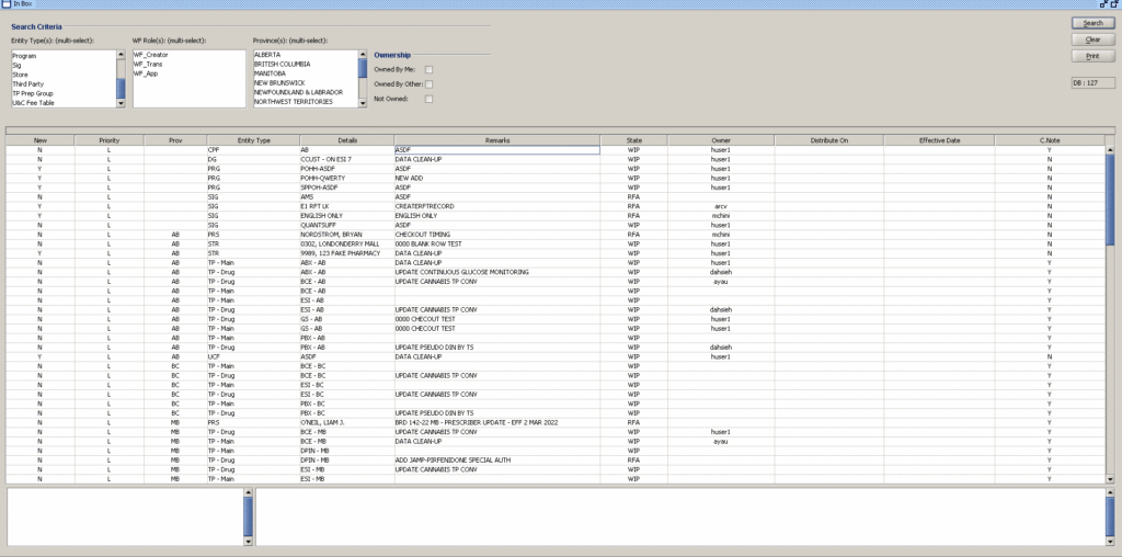
Legacy System
Design System
Color Palette
Primary
#1f97f4
Secondary
#bcdefc
Third
#e81010
Typography
Roboto
Headers and emphasis
Roboto
Subheadings and labels
Poppins
Body text and content
Tools Used
- Figma for design and prototyping
- Miro for user journey mapping
- Principle for micro-interactions
- UserTesting for validation
Key Solutions
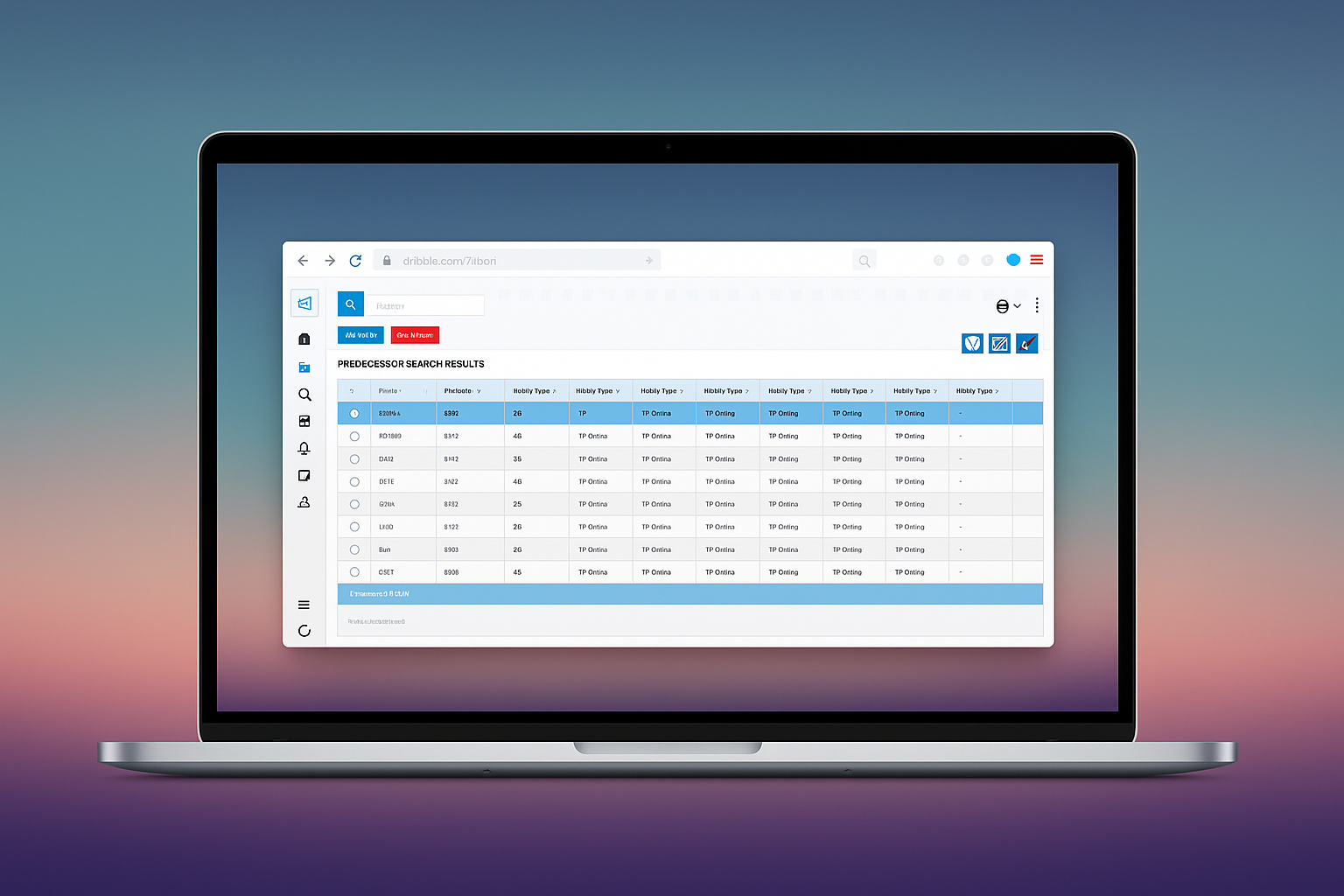
Streamlined Dashboard
Created a unified dashboard that consolidates all critical information and frequently-used tools. Real-time data visualization and customizable widgets allow users to focus on what matters most to their role.
- Personalized workspace for different user roles
- One-click access to common tasks
- Real-time inventory and pricing updates
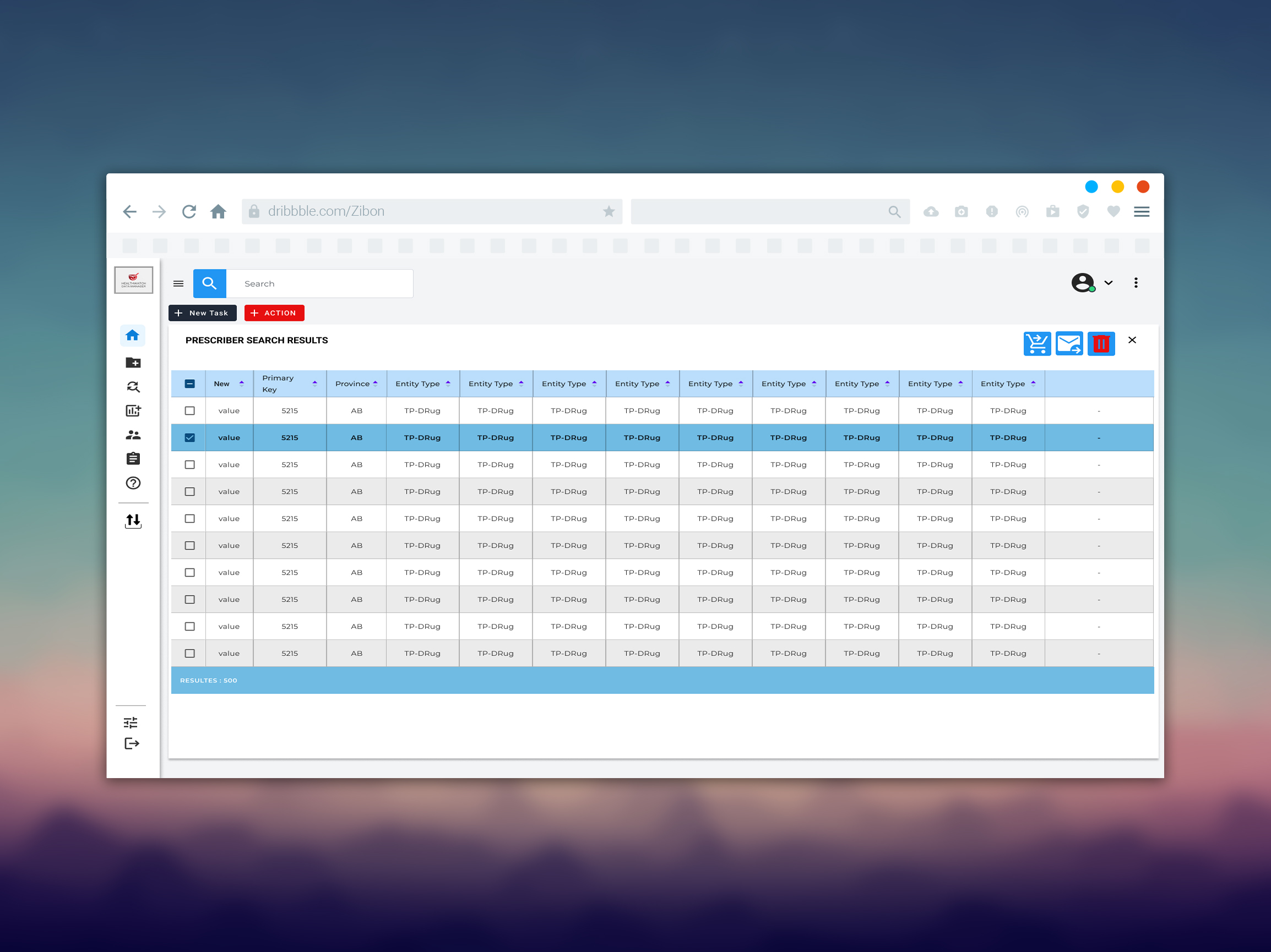
Enhanced Data Tables
Redesigned complex data tables with advanced filtering, sorting, and bulk actions. Smart search functionality and saved views help users quickly find and act on relevant information.
- Advanced filtering and search capabilities
- Bulk editing and actions
- Customizable column layouts
Consistent UI Patterns
Introduced a design system to unify the platform’s look and feel, ensuring a seamless and predictable experience across every screen. The system not only standardized visual elements but also guided interaction patterns, creating familiarity that reduced user errors and training time.
- Established a cohesive visual language with standardized colors, typography, and components
- Unified button styles, forms, and tables for a consistent interaction model
- Reduced cognitive load by making patterns predictable and reusable
Results & Impact
Qualitative Outcomes
- Reduced training time from 3 weeks to 5 days
- Enabled faster work and time process
- Decreased support tickets by 60%
- Improved decision-making speed
- Higher user satisfaction scores (4.7/5)
- Reduced operational costs by 25%
Key Learnings
What Worked Well
- Early and continuous user involvement throughout the process
- Phased rollout approach reduced risk and allowed for refinements
- Strong collaboration between design and development teams
- Created a unified design system to ensure consistency across UI and UX
- Comprehensive documentation facilitated smooth handoff
Areas for Improvement
- Could have involved users team earlier in the process
- Additional performance testing under peak load conditions
- Extended post-launch monitoring period for optimization
- Designing more proactively for future feature expansions (e.g., modular components) would ensure the system can evolve without major rework.
- Setting up recurring user feedback sessions post-launch would have allowed for faster detection of usability issues and continuous refinement
Project Success and Conclusion
Like What You See?
Let’s collaborate on your next project. I’m always excited to work on new challenges and create exceptional user experiences.